Project Overview
Problem Statement


Timeline
Team
Role
Tools
8 Weeks
Group of 4
UX/UI Designer
Figma, Figjam,
Photoshop, Canva and
google Form
Navigation Issues: Users struggle to navigate the website efficiently, leading to difficulties in finding and selecting desired products.
Incomplete Purchases: The poor user experience often results in potential customers abandoning their shopping process before completing a purchase.
Low Customer Numbers: The current number of customers is less than expected, highlighting a gap between business goals and actual performance.
Product Offering Visibility: The website fails to effectively showcase the business's wide range of products and services, making it difficult for users to understand their full offerings. To address these issues, the business is considering a complete website redesign.
Redesign Process


My team of 4 ran a double Diamond method based on the Design Thinking Methodology. It was not a linear path, we bounced between stages as the project progressed.
Discover
Prior to conducting user interviews, our team of four performed a heuristic evaluation of the website to identify major usability issues and gain insights into key areas for user research.


Heuristic Evaluation
Survey


Birthdays and anniversaries are the most popular occasions for buying flowers. In response:
we've made these categories more accessible and noticeable in the navigation bar .
We've also placed these occasions as the first option in the filter.
Price and high-quality images are top priorities for customers. To address this:
We've implemented a price filter to help customers easily find products within their budget.
With the business allowing us to take charge of this section, we've provided insights on how the flower photos should be presented, ensuring that clear, high-quality images are displayed with the help of AI to generate the website photos.
Define


Interview & Affinity Diagram
Key Takeaways:
Prioritize delivery and packaging: This is the most critical aspect and should be the primary focus.
Categorize by occasion: Flowers should be organized based on different occasions for easier selection.
Provide filters: Include options for customers to filter flowers based on their specific needs and preferences.
Transparent pricing: Ensure that prices are clearly displayed and easy to find.
Highlight reviews: Make customer reviews readily accessible.
Include detailed descriptions: Offer comprehensive information, including care instructions, longevity, and size of the flowers.


Competitive Analysis
We performed a competitive analysis to identify key areas where our website can improve and gain insights from competitors.
We also noticed that businesses offering same-day delivery often feature this option separately in the navigation bar, so we've implemented this approach on our website as well.
Story Board


Lilly's primary concerns are finding a range of price options for bouquets, along with a trustworthy service that guarantees fresh flowers and timely delivery.
Persona


Site Map


User Flow


Develop


Sketch
Low- Fidelity
Mid- Fidelity


Mood Board
UI kit


Deliver
High Fidelity Wireframe


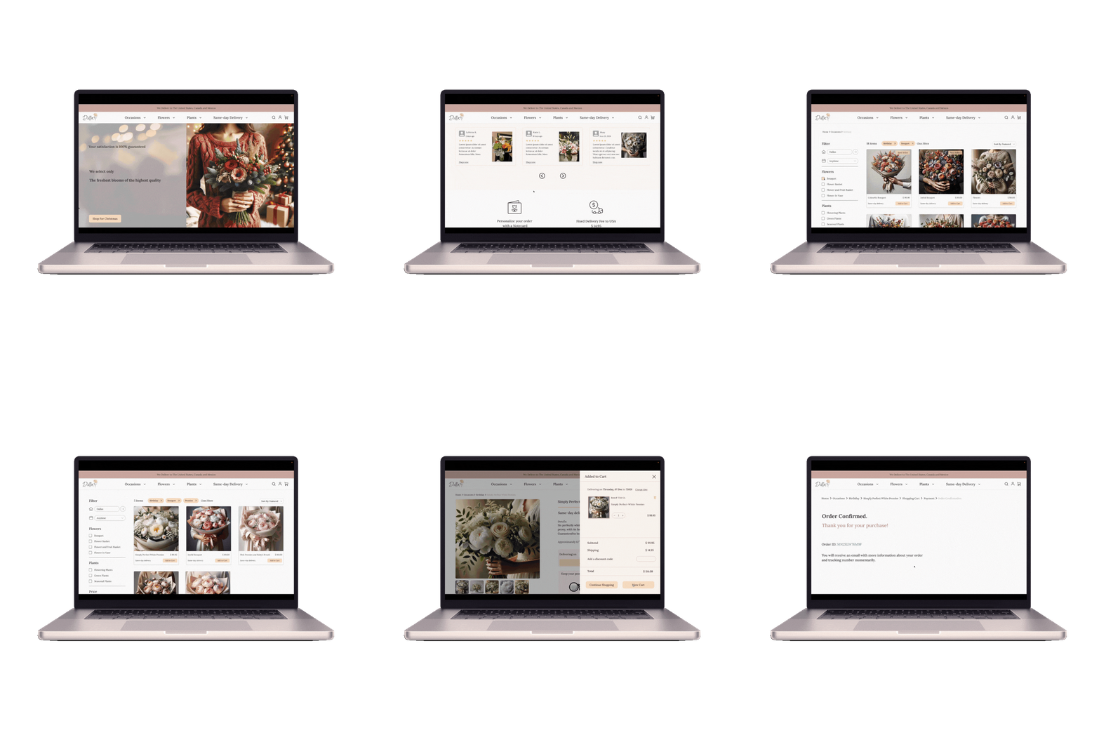
Here is the last prototype, displaying what we've achieved through our design process.
Prototype


Iteration and Usability Test


Before Usability Testing
After Usability Testing
Added a 'Same-Day Delivery' dropdown to clearly show where the service is available. Previously, this information was only in the 'About Us' section, which caused confusion. Some users thought same-day delivery included Canada and Mexico because those countries were mentioned at the top of the page. This update makes the details clear and easy to find.
The return policy for flowers was previously only mentioned at checkout. Since freshness and timely delivery are important to users, and they were actively looking for this information during their purchases, we’ve added it to the homepage, right after the review section, for better visibility
"Home Page"


After Usability Testing
Before Usability Testing
The postal code input box was moved to the filter section to ensure users consider both options together, as the postal code is essential for availability also a dropdown with days and dates was included to make selecting a delivery date easier and more intuitive for users.
Adjusted the category page to display more options and pictures with less scrolling, making it easier for users to browse and explore products quickly
Reordered the price filter in the filter section, placing it after the flower and plant filter. This adjustment was made based on user behavior, as they preferred to select a price range after choosing the type of product.
"Category Page"


Users wanted to confirm the selected delivery date before adding a product to their cart, so we incorporated this feature.
Users expressed a desire to see more product reviews before making a purchase, so reviews were added to the product page as well.
Before Usability Testing
After Usability Testing
What have I learned?
Research played a key role in making the product work better.
Working together as a team helped us deliver on time and stick to deadlines.
Testing and tweaking made the product easier and more enjoyable to use.
Building a UI kit kept everything consistent and made communication smoother.
Evaluating the current design and testing it with elderly users to check accessibility.


